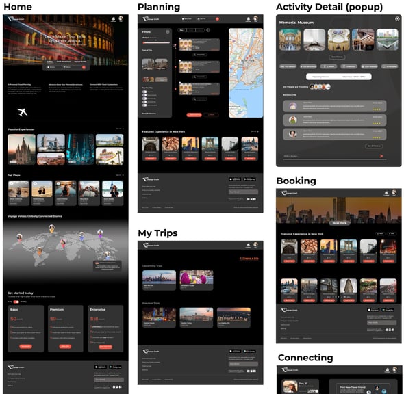
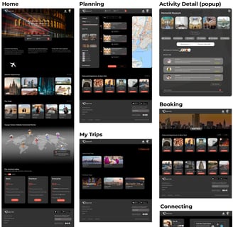
Discover
User Research
To better understand our target user's needs, we implemented three phases in our research:
1. Competitive Analysis
2. Surveys
3. Interviews
Competitive Analysis
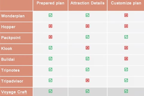
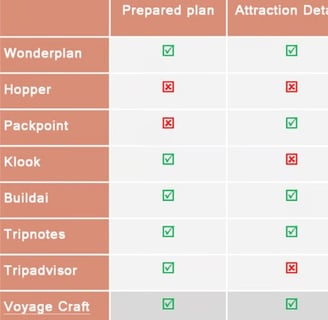
To improve our platform, we analyzed other similar websites, gaining key insights into best practices and differentiation opportunities.
Wonderplan: Effective filtering & UX writing
Tripadvisor: Comprehensive attraction details
OpenAI: Sleek, modern AI-driven design
Airbnb/Expedia: Intuitive search box functionality
By leveraging these insights, we refined our value propositions and enhanced usability for a better travel planning experience.
Survey
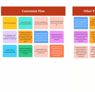
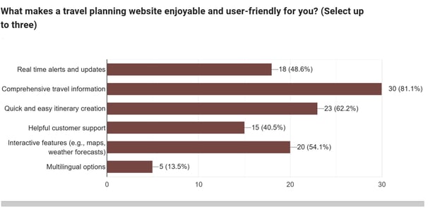
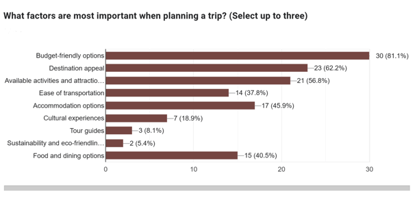
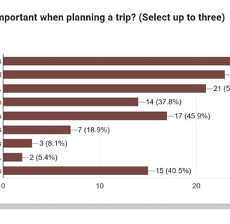
We conducted a survey to better understand user needs and behaviors, ensuring a user-centered approach in our design. Using Google Forms, we reached out to around 100 potential users, gathering valuable insights to shape our product and services.
Interview
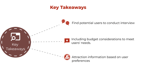
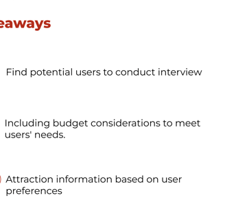
In the next step, we conducted interviews to explore:
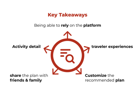
How we can foster trust in AI and encourage travelers to connect with others by sharing their activities and experiences with a travel companion.
How users respond to similar platforms and what their expectations are.
How individuals discover attractions and what detailed information they need about them.



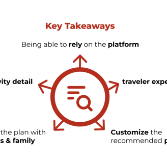
Difine
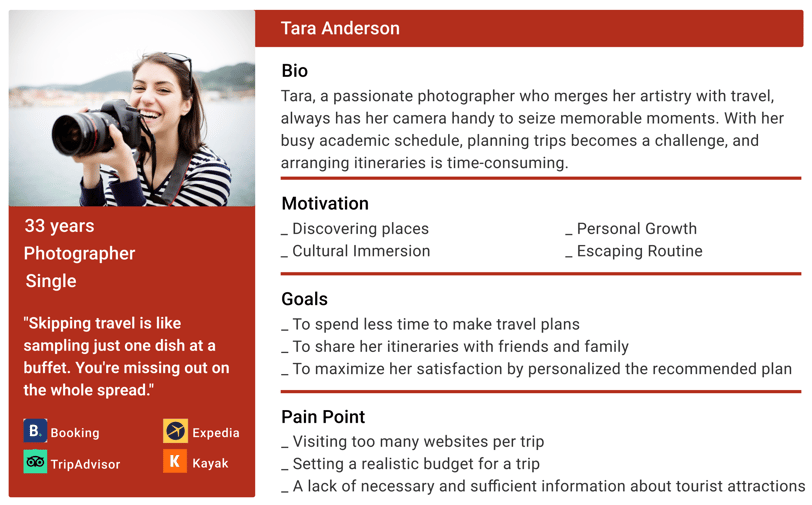
Based on research insights, the persona was defined to humanize potential users, highlighting their goals and behaviors to ensure every design decision aligns with their needs and expectations.
User Persona
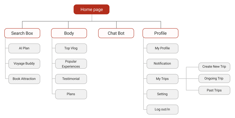
Site Map
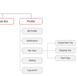
Card sorting helped us create an initial site map, which was refined through user testing and competitive analysis to improve usability and navigation.
User Flow
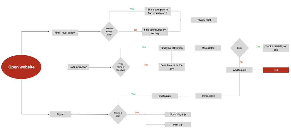
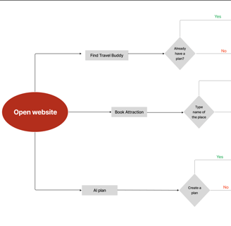
As we move into the ideation phase, we developed user flows to map out each step users take from entry to their final interaction. This helps us visualize their journey and refine the experience to better support their goals within the application.
Design
First Designs
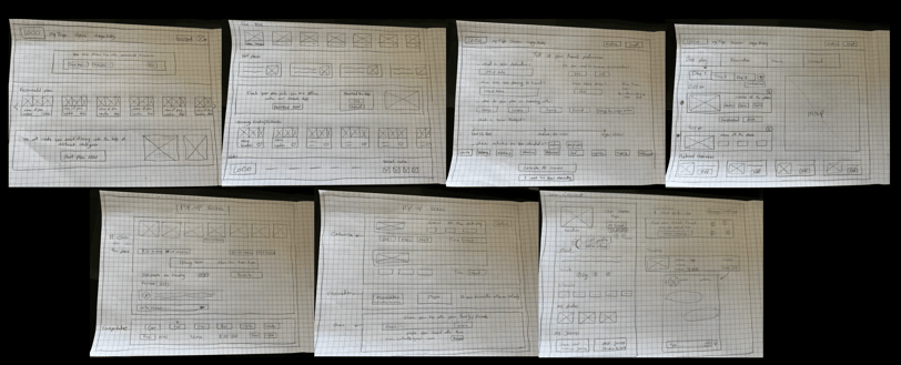
Beginning with hand-drawn sketches we visualized our ideas and fostered team collaboration.
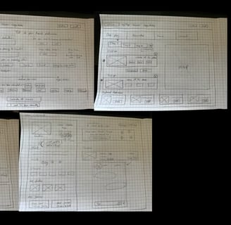
First Designs
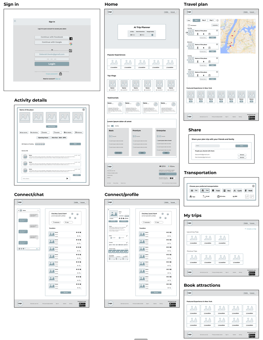
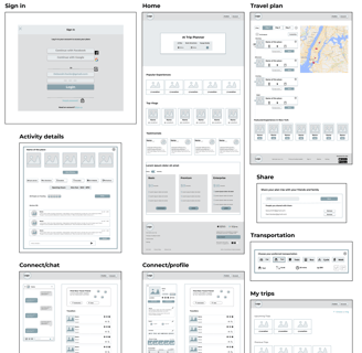
Next, we developed low- to mid-fidelity wireframes, guided by insights from our research and user stories. This process allowed us to explore design ideas, iterate quickly, and refine key concepts before focusing on the details.


Challenges & Solutions:
Since our platform offers multiple features, our main challenge was ensuring users clearly understand its purpose and can navigate it with ease.
Challenges 1:
Solution1/1
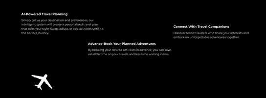
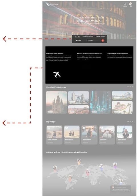
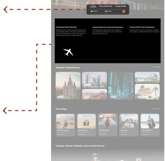
We designed a search box in the hero section to showcase the platform's capabilities, enabling users to find what they need quickly and effortlessly.
Right after the hero section, we added an interactive animation to walk users through the key steps based on their needs.
Solution1/2
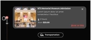
The next challenge was ensuring users recognized the flexibility of AI-generated travel plans. It was crucial to communicate that the recommendations were not fixed and could be customized to suit their preferences.


Challenges 2:
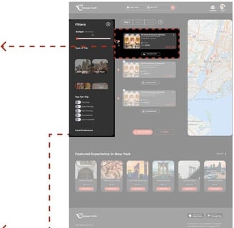
We've made each activity card closable and draggable, featuring an easy interaction icon (Up & Down).
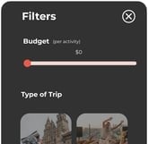
Plus, we've introduced a filter system, allowing users to refine their options and find what they need more easily.
Solution 2/1
Solution 2/2
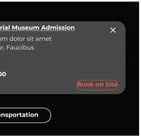
Our third challenge was ensuring users had enough information about each AI-generated activity plan to determine their interests.
Challenges 3:
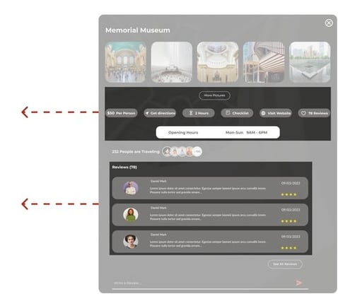
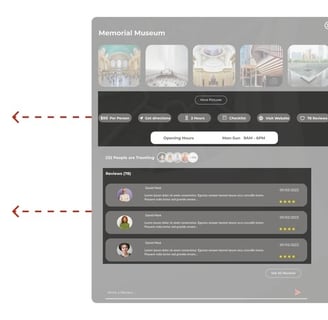
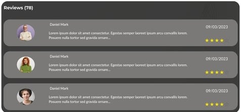
We organized the information based on user preferences, highlighting key details upfront for quick visibility. Additional details, such as more images, ticket prices (if applicable), and reviews, were accessible upon clicking each activity.
Solution 3

While creating the mood board, we integrated the Material Design system for icons and other elements, ensuring a consistent and cohesive user experience.
UI Design Direction
Mood Board
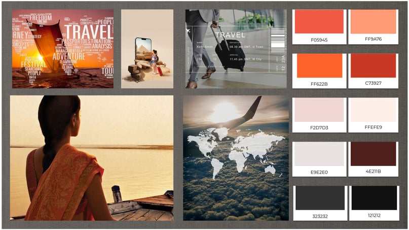
UI Kit
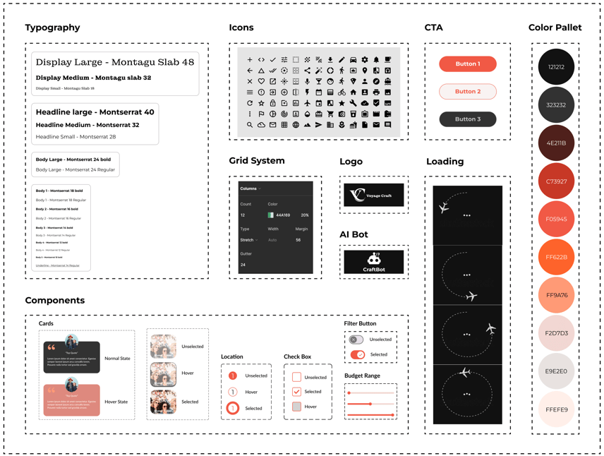
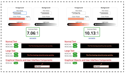
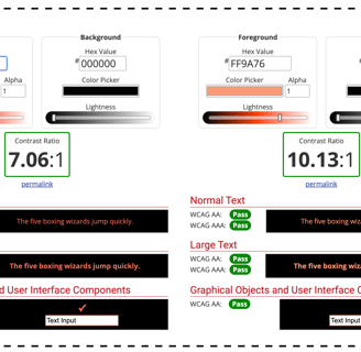
We tested the contrast between foreground and background colors for primary and secondary buttons using color blindness evaluation tools to ensure accessibility and readability.
Color Accessibility
Testing
Usability & Iteration
Phase 1
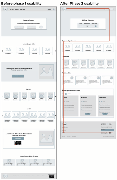
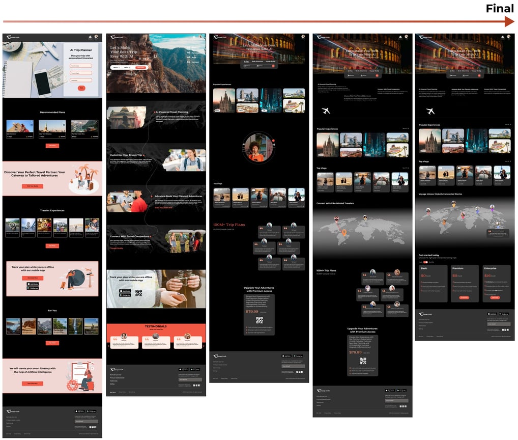
In the initial design phase, we created multiple homepage variations and tested them with users. Through iterative refinements and eye-tracking research, we found that users typically followed either a Z or F pattern. Based on these insights, we selected the final version for further development.
Phase 2
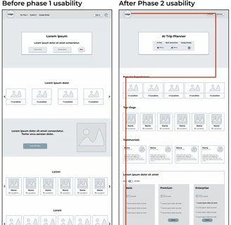
We conducted testing with 10 participants, assigning each a specific task to complete.
Task: Users were asked to use the AI planning feature to create a personalized itinerary for their upcoming trip. Starting from the homepage, they navigated by scrolling down to explore the platform and searched for the option to find their AI-generated plan. Through iterative design and user feedback, we refined the final version to enhance navigation and ease of use.

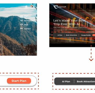
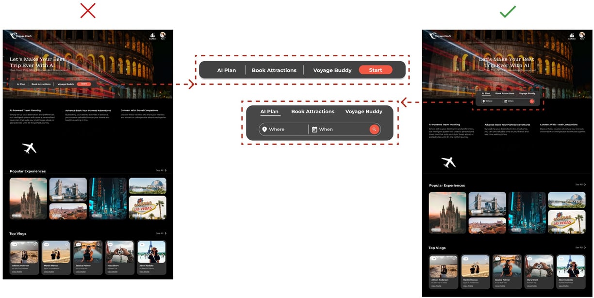
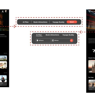
After sketching multiple design concepts for the search box in the homepage hero section, we created two high-fidelity prototypes. Using feedback from A/B testing, we refined the design. The results showed that 80% of users successfully navigated Version B and completed their tasks without errors, finishing 50 seconds faster than with Version A.
Phase Three (A-B Testing)
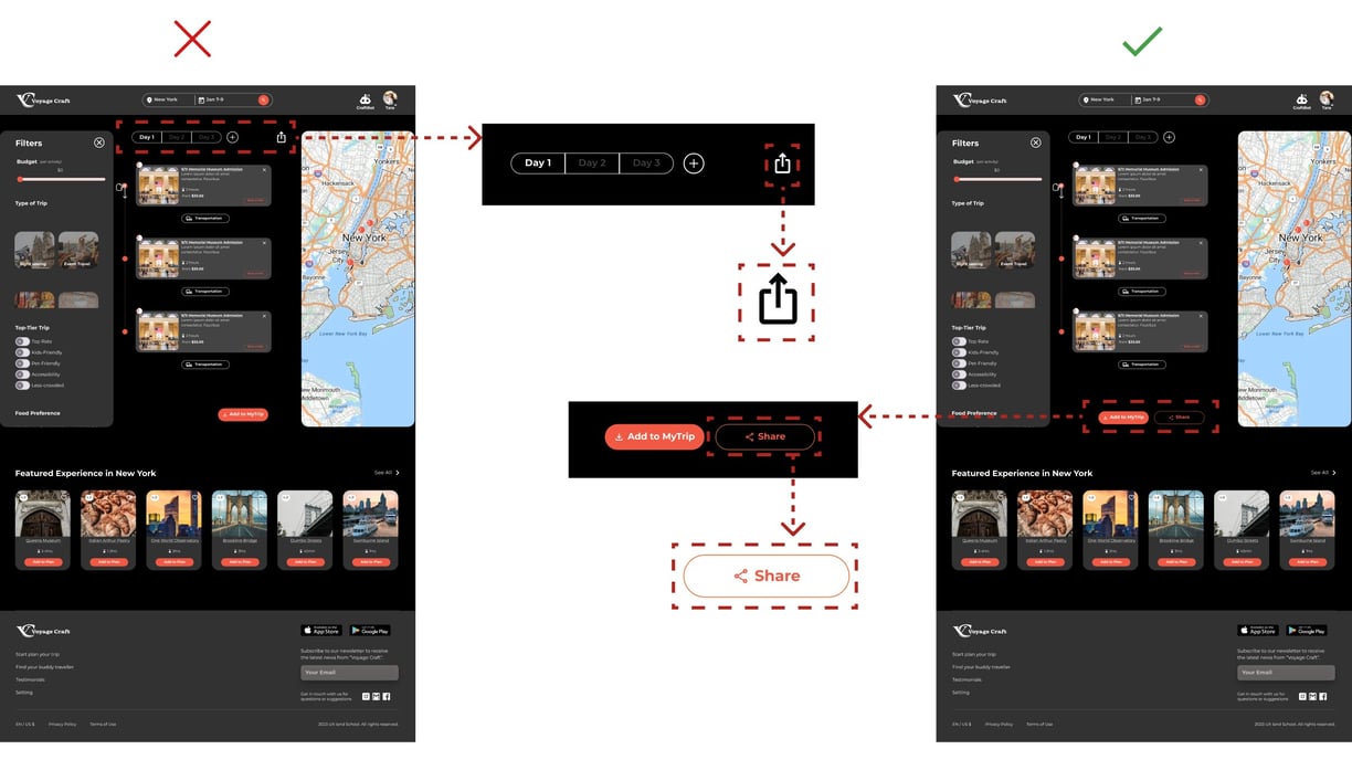
In another round of A/B testing, we developed two versions of the website's sharing feature. We found that using "Share" as a call-to-action (CTA) made it easier for users to access compared to just an icon. Out of 8 users, 5 preferred the version with "Share" as a CTA.
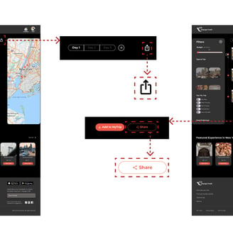
Version 1 before usability
Version 2 after usability
Version 3 after usability
Final version after usability
Self-improvement UI iterations on “Homepage”
Deliver
Reflection
Balancing User and Stakeholder Needs – Finding the right balance between user expectations and stakeholder marketing goals was essential to the project's success.
Enhancing Technical Skills – I strengthened my ability to work with AI algorithms to deliver personalized recommendations.
Effective Communication & Leadership – I honed my communication skills, ensuring smooth collaboration and guiding the team through challenges.
Embracing the Learning Process – The most valuable lesson was understanding that success isn’t about being right from the start but about adapting and improving through continuous learning.
We can improve trip planning by introducing a "My Trip" page, allowing users to easily access and manage all their trip options.
Additionally, evaluating the current design and testing it with elderly users will help ensure accessibility and usability for a wider audience.
