Dallas Flower Shop
Responsive Web Redesign
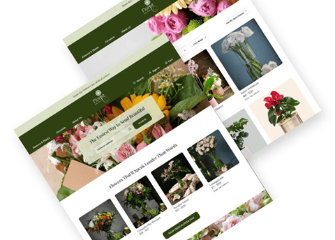
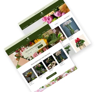
This project highlights our work in redesigning an online floral boutique's website, aiming to enhance the overall user experience. We focused on improving every step, from browsing the flower catalog to making purchases and scheduling deliveries.
PROJECT OVERVIEW








10 weeks-Part time
UX Researcher UI Designer
Group of Four
Tools
Devices
A flower shop located in Dallas, TX
Shipping nationwide across the USA and Canada
Products include flower baskets, bouquets, plants, flower stands, fruit baskets, and sweets baskets
100% Satisfaction Guarantee, customizable options, and same-day delivery available within the Dallas area
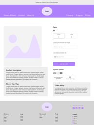
Improving the website's information architecture, enhancing product care details, and updating the design are key to boosting sales.
There is also a pressing need to enhance the filtering capabilities to better meet customer expectations.
Business Analysis:
Key Business Needs:
Our Approach:
To better understand prospective users and their needs to provide seamless and intuitive navigation we conducted:
User interviews to address concerns and needs
Surveys to explore why users hesitate to buy plants online
DESIGN PROCESS
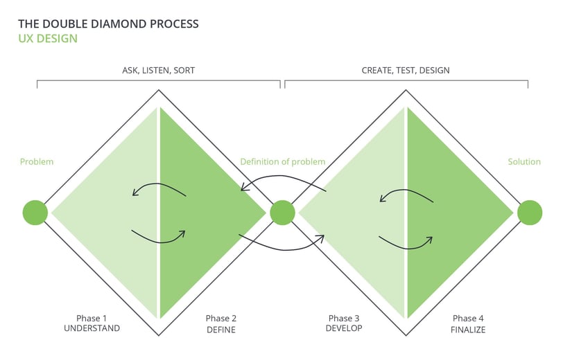
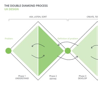
Our team of four implemented a Double Diamond Design approach inspired by the Design Thinking Methodology. It wasn't a linear path, we went back and forth between stages as the project progressed.
DISCOVER
To identify user pain points and create effective solutions, we used a thorough research approach that included the following methods:
Heuristic Evaluation
Competitive Analysis
Online Survey
Interview
Heuristic Evaluation
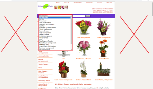
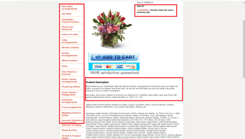
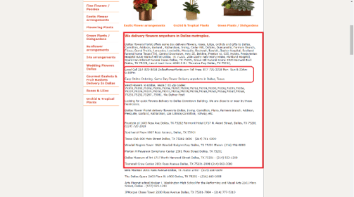
We applied the Heuristic evaluation model to conduct a thorough assessment of the business website, systematically scrutinizing its content across four main themes.
What did we find?



Competitive Analysis
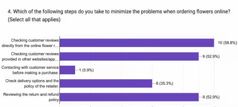
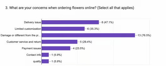
Survey Insights
Target audience
Research Process
Lack of Clarity:
· Product categories are not clearly organized.
· The goals of the website are not well-defined or prioritized.
· Users are unsure of the desired actions to take.
· Navigation terms are unfamiliar and confusing.
Lack of Consistency:
· Language and categorization are inconsistent.
· The homepage displays various visual styles, with different color schemes and fonts.
· The design aesthetic appears dated and lacks cohesion.
· Untitled and randomly placed images on the homepage contribute to the inconsistency.
Lack of Efficiency:
· Popular categories are not easily accessible.
· Some buttons on the website are non-functional.
· Users face difficulties when adding multiple items to the cart without starting over.
· There is no option for users to change the quantity of items in the cart.
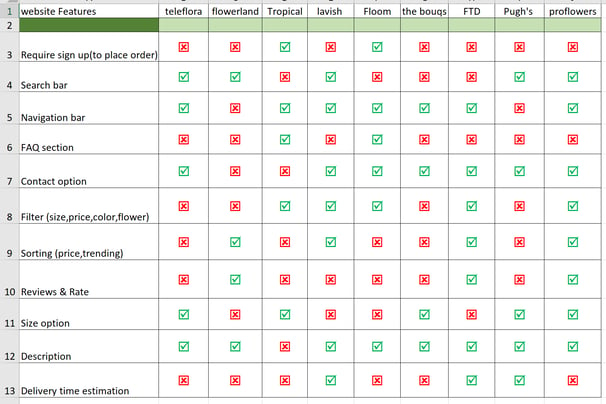
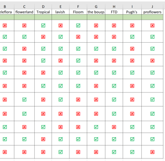
At this stage, we analyzed nine flower and plant shops, evaluated their e-commerce experiences, and aligned the findings with our project objectives.
We identified the ideal customers for the flower shop based on their demographics, online behavior, and preferences.
Key takeaways:
Identified usability pain points, guiding improvements in navigation and user interface.
Obtained insights into product preferences, influencing decisions on presentation and categorization.
Uncovered user expectations regarding delivery, payment, and overall shopping experience.
Interview insights
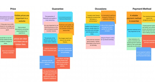
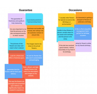
Through interviews and an affinity diagram, we identified key customer priorities.
Freshness guaranteed
Price options
Reliable payment methods
Birthdays were the most common occasion for purchasing flowers
DEFINE
Persona


Using insights from proto-personas, surveys, and interviews, we created a detailed persona to guide design decisions, ensuring the website meets user needs and expectations.
We made a story board and a context scenario in order to have a more profound empathy for the users.


Story Board
Card Sorting
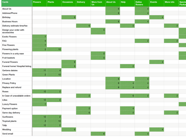
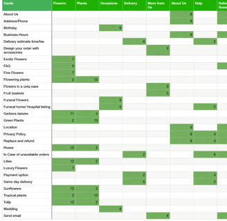
We conducted an open card sorting study based on competitive analysis and heuristic evaluation. 15 people participated in the online research and created their own categories. Below are the results.
How should the website be arranged according to users?
Site Map
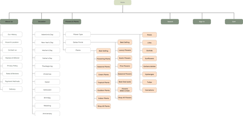
Informed by our research findings, we redesigned the information architecture

User Flow
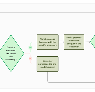
We made buying flowers easier by improving search, selection, and payment. Our intuitive design ensured a smooth user journey from choosing a bouquet to checkout.



Develope
Sketch & Wireframing
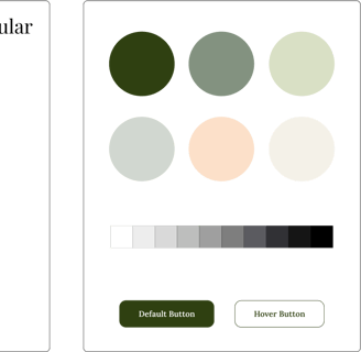
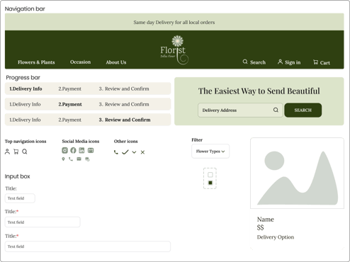
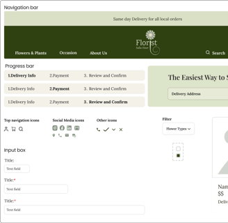
UI Kit
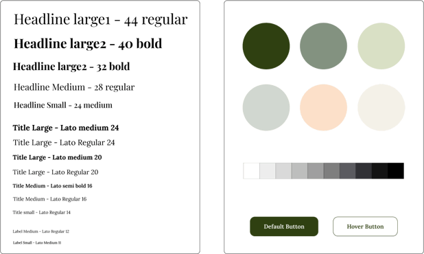
We refined our UI Kit for consistency, alignment with the website’s needs, and a user-friendly experience, featuring:
Typeface: A carefully chosen font for readability and brand consistency.
Colors: A cohesive palette for a visually appealing and memorable interface.
Input Boxes: Stylish and functional, ensuring a seamless user experience.
Buttons: Intuitive design, promoting engagement and clear calls to action.
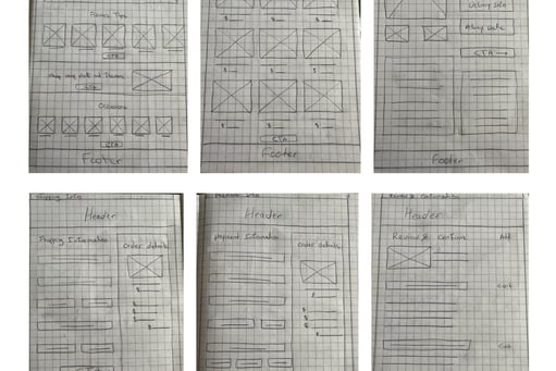
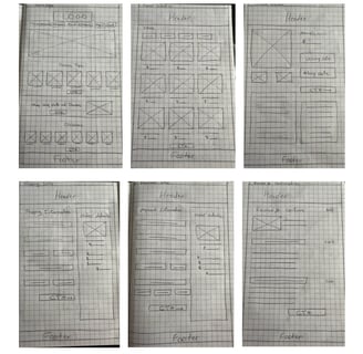
We explored our design ideas together through quick sketches to refine layout, flow, and user interactions.

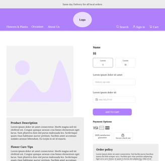
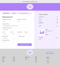
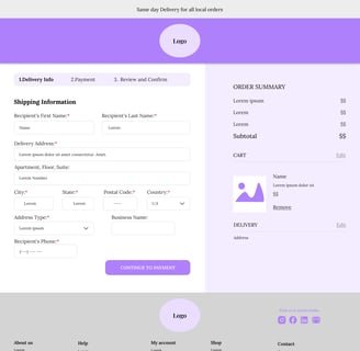
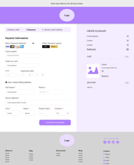
Home Page
Product Page
Flower Selection
Shipping
Payment
Confirmation
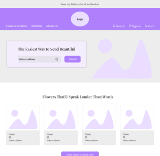
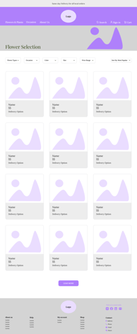
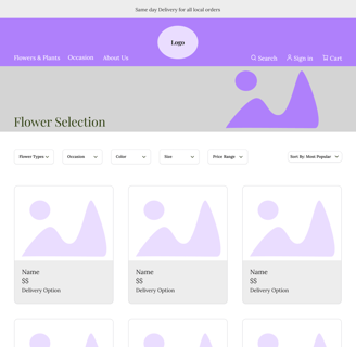
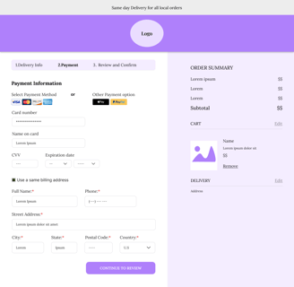
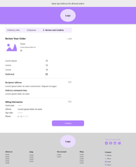
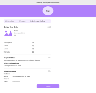
Next, we transformed sketches into digital wireframes for testing. This step helped identify issues, refine solutions, and ensure the design met user needs. We continuously improved the designs before creating more detailed versions.
Wireframing
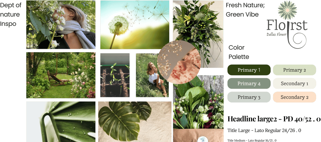
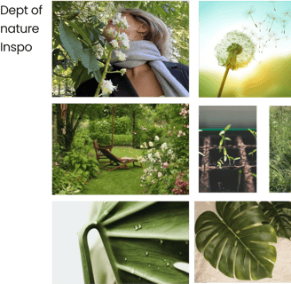
Mood Board
Our mood board showcases a palette of dark and light greens, complemented by soft cream and pale pink tones. These colors evoke natural beauty, freshness, and warmth. In psychology,
. Dark green is associated with sophistication
. Light green brings vibrancy
. Cream adds elegance
. Pale pink introduces charm
This color scheme aligns with the floral theme and leverages psychological principles to create a harmonious and inviting atmosphere for the redesigned flower shop.
Test

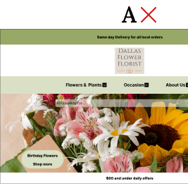
After multiple ideation rounds, we tested two hero search box designs with 13 participants. Based on user feedback, we refined the final prototype for better satisfaction and functionality.
A/B Testing
Usability Tests
1) After usability testing, we enhanced the website’s visuals by updating the header with vibrant colors and a redesigned logo. To improve accessibility, we enlarged the zip code field and repositioned it in the hero section.
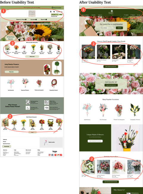
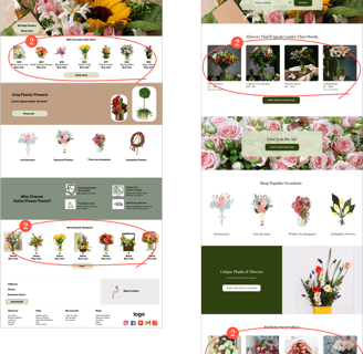
2) We noticed visibility issues with product cards due to overcrowded information. To improve clarity and user experience, we resized the cards and adjusted the layout.
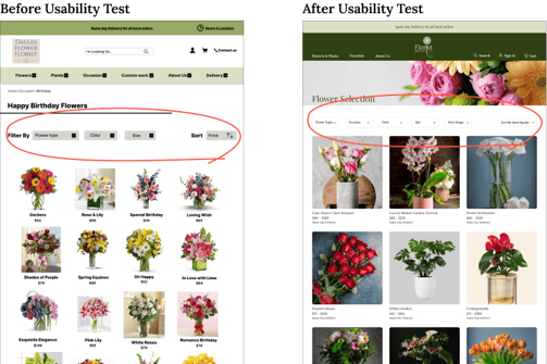
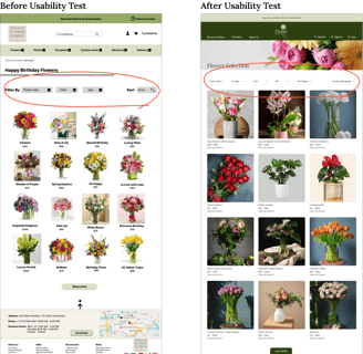
3) Next we refined the filter boxes, resized product cards, and updated their design. Additionally, we added extra filters to better accommodate user needs.
Deliver
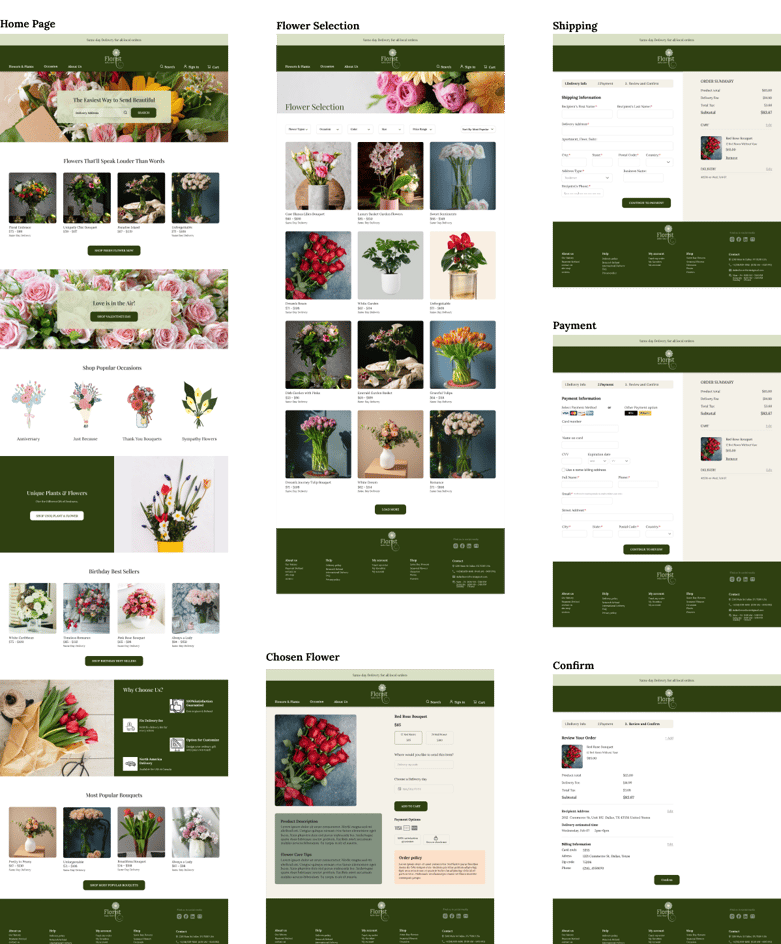
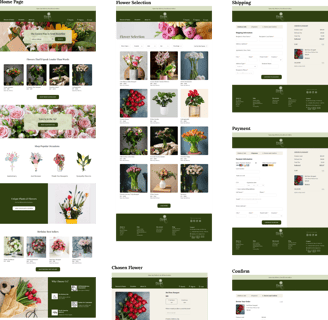
This prototype reflects everything we refined along the way, bringing our design to life.
User-Ready Design
Reflection
The Dallas Flower Shop website redesign strengthened its visual identity and user experience to better connect with its audience. Through user research, we refined design elements to enhance engagement. The final design strikes a balance between business goals and user needs, demonstrating the power of simplicity and intuitiveness.
What did I learn?
What can we do next?
Develop a mobile-responsive version of the website for better accessibility on phones.
Plan to enhance the website's accessibility to make it more user-friendly.
Following this, we'll enhance the user experience by conducting additional usability testing and iterations to refine the user flow further.